

Decorating With Color Even if You’re a Minimalist

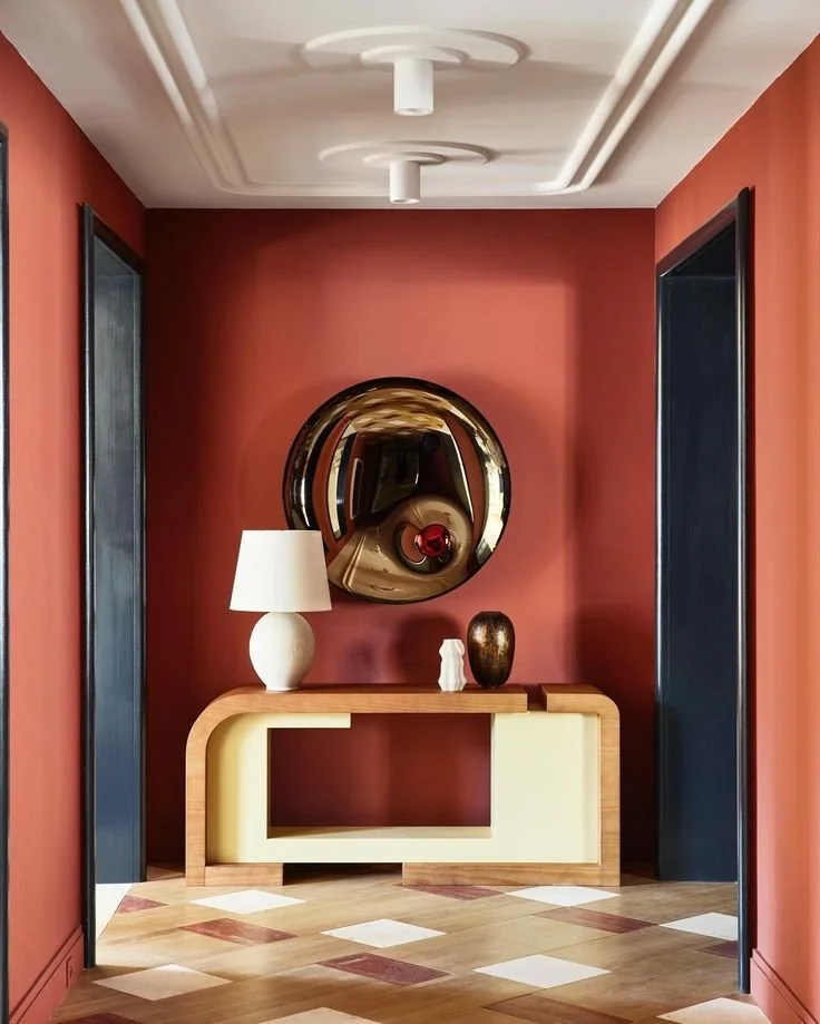
Our favorite interiors featuring elegant use of color, from top right: Alyssa Kapito, Double G, Laura Lee Clark and Fabrice Juan.
Calling all minimalists, and neutral decor lovers (myself included, I have 7 different types of white wallpaper in my home…seriously, I love the color white.) We are making a conscious decision to embrace color. Why? Because color makes us happy, and I want to design interiors that make our clients happy.
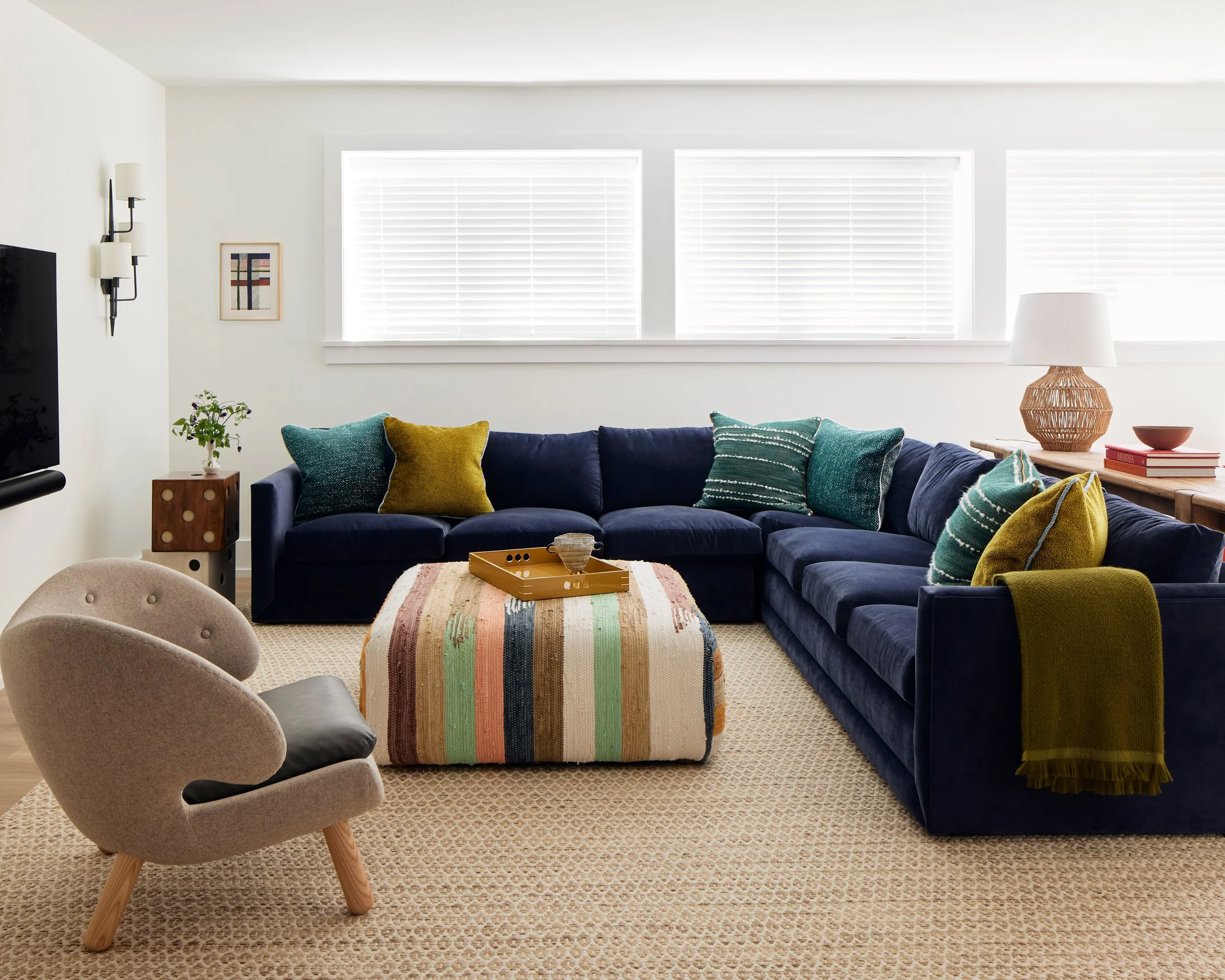
We brought fun pops of color into our client’s light-filled family room, by paring a beautiful navy sofa with pops of green and gold throw pillows. Interior design by Libarikian Interiors, Photo by Gieves Anderson.
Color is an instant mood enhancer, and it has the power the transform how a room feels. But we are often confronted with the question of longevity, and the will-I-love-it-tomorrow question. Since we are all about elegant design, I have rounded up our favorite examples of how to best use color in a space and still keep your home feeling elegant and timeless.
The Monochromatic Color Scheme
Design by Alyssa Kapito.
This is my favorite way to use color in a space because I am all about serenity in a home. I want a home to feel soothing, with a just a few rooms sprinkled throughout that give a jolt of energy (small rooms are perfect for this).
The key to this look is managing contrast. High contrast gives us energy in a space, and low contrast helps keep things calm.
When designing a monochromatic look, choose a single hue (such as pale blue, or pink, or green, or any color that makes you happy) and repeat it in slight tone variations throughout the space…some lighter, some darker. Paint the walls, ceilings, and trim all the same color, and include a few neutrals to ground it, such as white, black, brass, or wood tones.
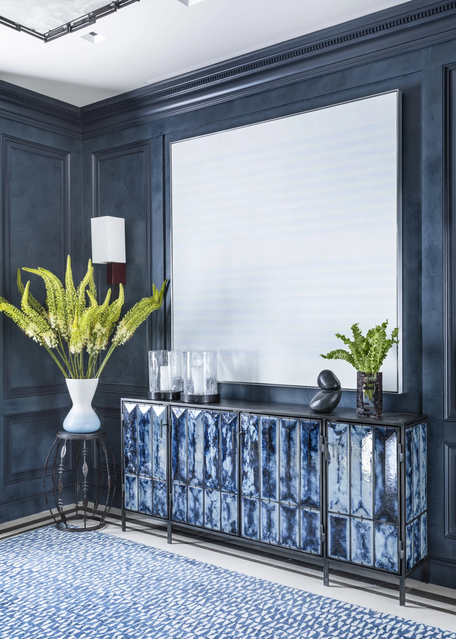
Design by Victoria Hagan.
The walls, sideboard and rug all carry the same blue tone but in varying textures, and they are balanced with white in the art, ceiling and floors.
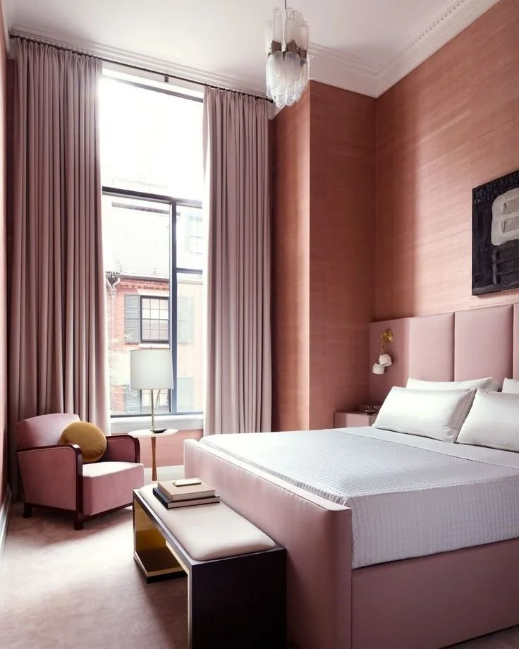
Design by Lisa Tharp. Photo by Jared Kuzia.
An all pink bedroom that feels luxurious and serene. The similar tone in all the furnishings keeps the visual contrast to a minimum, and the white bedding makes the color feel fresh.
The Refined Finish
I am convinced that designers can make almost any color feel refined simply by manifesting it in a very expensive finish…such as lacquered paint, dewy matte finish on skim coated walls, or tadelakt plaster. The reason expensive finishes enhance color is that they pair exquisite texture with unparalleled depth of color…the result is simply captivating.
Notice in these examples how the finish on the walls enhances the color. Super smooth walls require a lot of skilled labor to achieve, they cost a lot, but they are worth every penny.
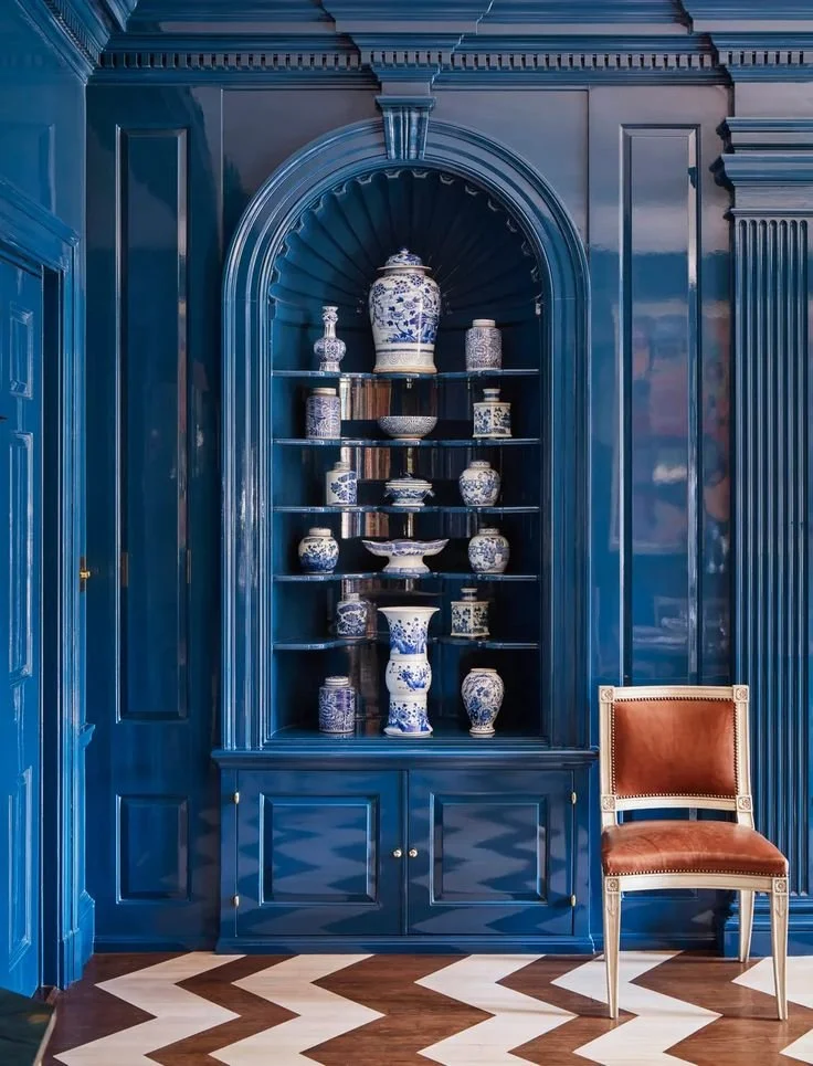
Design by Ashley Whittaker
This interior by Ashley Whittaker sings in lacquer, and highlights the lustrous peacock blue in a way that makes it feel bright and joyful. If you love this room as much as we do, check out the full house tour on Veranda.
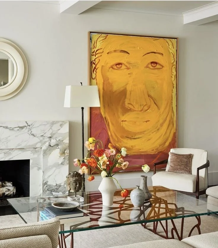
The Pop of Color on Your Sofa (or Art)

Design by Double J Interiors.
Sometimes, the best way to use color to great effect is to use it as a pop in an otherwise neutral interior. Think of a rich colored sofa, or a bright work of art that draws the eye in. For clients who love the all white interior, we love injecting a pop of color.
Design by Lilian H. Weinreich, Photo by Nicole Franzen.
Design by A. Lantz Design
Art by Mel Bochner in the entry designed by A. Lantz Design, gives the otherwise all white interior a point of interest.
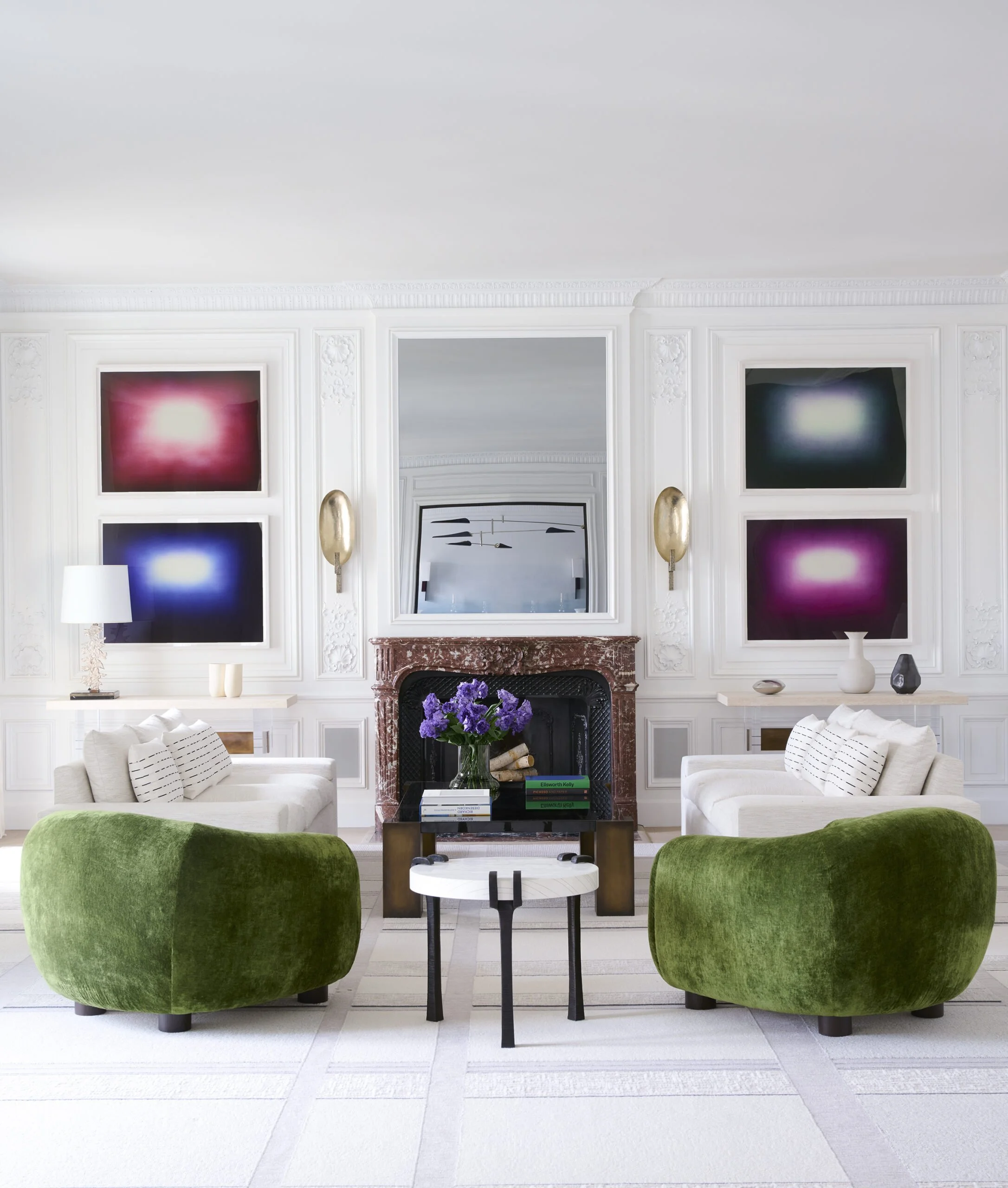
An iconic design by Victoria Hagan proves that even all white interiors can come to life color. The red tones in the art pair beautifully with the solid green chairs, creating high drama in what would have been an otherwise unremarkable interior.
The Bold Walls Paired with Muted Tones
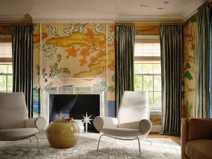
If you are adventurous, this is example is for you. Highly patterned, richly colored walls are paired with otherwise muted colors to great effect here, with the cream chairs, and muted olive drapery.
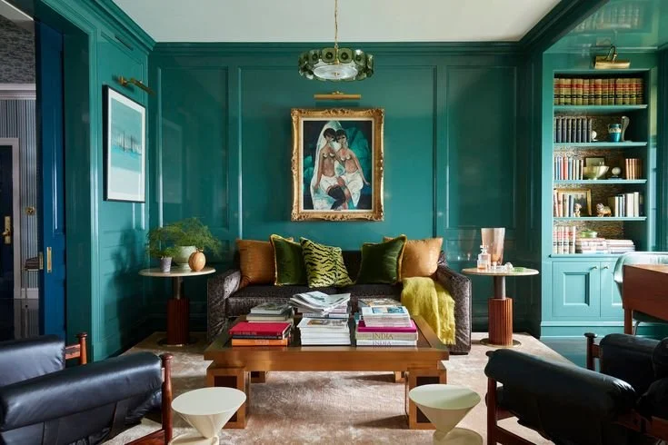
Design by Summer Thornton.
The bold teal walls are paired with darker muted tones in the furniture so that the color can really shine in the space.
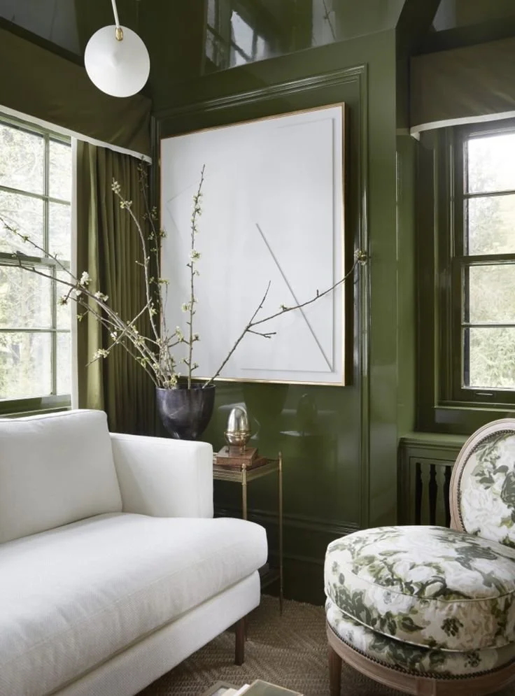
Design by Wendy Labrume.
This is my favorite example of how a bold color choice on the walls, paired with lighter furniture can all of a sudden feel exciting without actually being overwhelming.
So next time you have the urge to just paint everything white in your home, stop and think about what colors bring you joy, and then forge ahead with bold plans (…because we always regret the things we *don’t do) of bringing color into your home. Or call us, and we’ll help you get there!